This guide explains the Column Mode: Auto settings in a Group module. Column Mode controls how the modules inside a Group are divided into columns. When the mode is set to Fixed, desktop layouts follow a 12-column system and mobile layouts become a single column. That rule is simple, but it does not adapt well to screen sizes between desktop and mobile. Auto mode provides a more flexible layout for those middle sizes.
How to Navigate to the Column Mode Setting

Open the page in BM Content Builder, edit the target Group module, and stay in General Settings. Find Column Mode below the horizontal and vertical alignment controls. Open the dropdown and choose Auto.
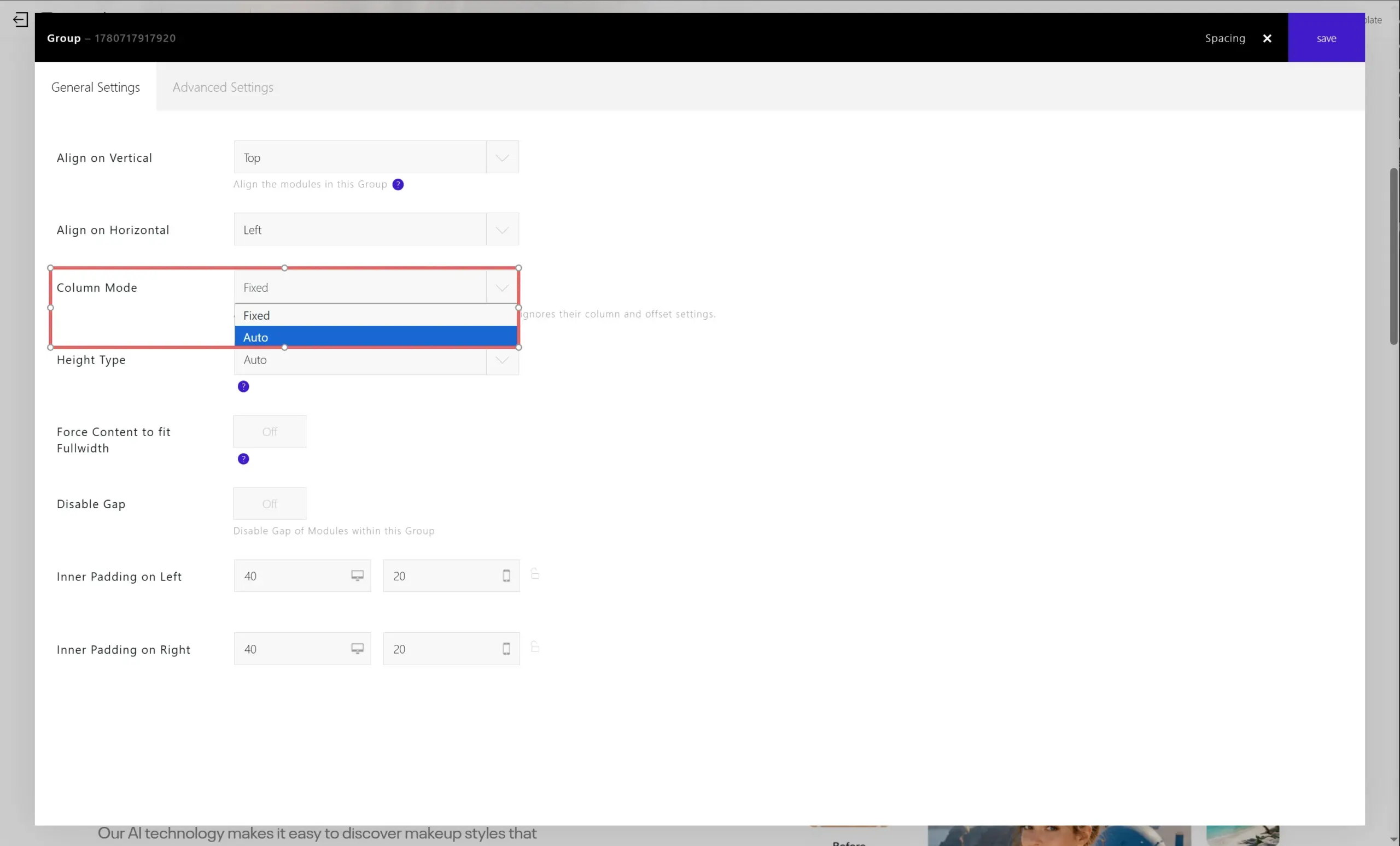
What Column Mode Controls
Column Mode affects the modules inside the current Group. It does not change the content itself. Instead, it decides how many internal columns should appear as the available width changes.
Use Fixed when the layout should follow the normal 12-column desktop grid and collapse to one column on mobile. Use Auto when the Group contains repeated items, feature blocks, icon lists, pricing items, or other modules that should reflow more smoothly across intermediate screen widths.
Column Strategy
After switching Column Mode to Auto, the Column Strategy option defines how the builder chooses the number of columns. The available strategies are Fluid, Balanced (4 / 2 / 1), and Custom.
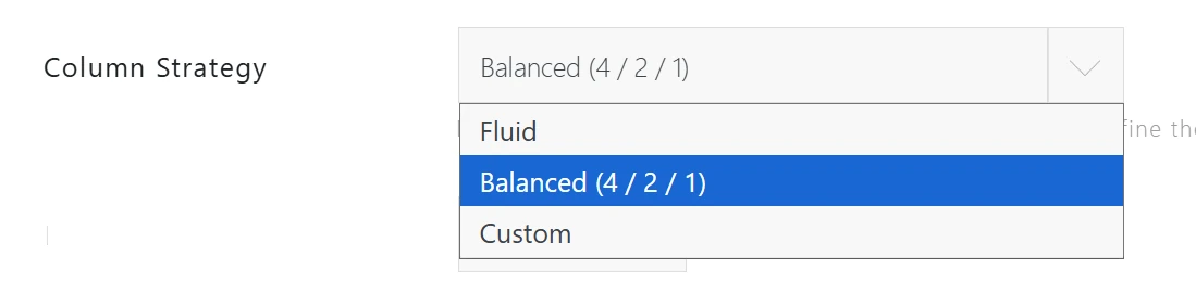
Fluid lets the layout respond naturally based on the minimum module width. Balanced (4 / 2 / 1) keeps a common responsive pattern: four columns on wide screens, two columns on medium screens, and one column on small screens. Custom is useful when you want to define the exact sequence yourself.
Custom Column Steps
When Column Strategy is set to Custom, the Column Steps field lets you enter a sequence such as 4,2,1. This means the Group can display four columns when there is enough room, then two columns on narrower screens, and finally one column on small screens.
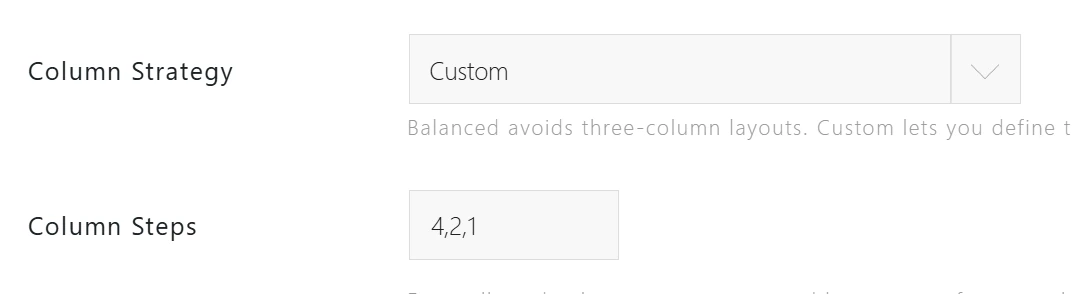
This is more flexible than Fixed mode because the Group can adapt before it reaches the mobile breakpoint. It helps avoid crowded or squeezed content at tablet widths and narrow desktop widths.
Minimum Module Width
Minimum Module Width defines the approximate minimum width, in pixels, that each internal module should keep before the layout reduces the number of columns. For example, a value of 400 tells the Group not to keep modules in a multi-column row if each module would become too narrow.
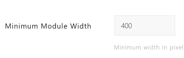
Increase this value when the modules contain long text, buttons, or detailed content that needs more horizontal space. Decrease it when the modules are compact, such as icons with short labels.
Why Fixed Mode Can Become Crowded
Fixed mode is predictable: desktop uses the 12-column grid and mobile collapses to one column. However, it has fewer decisions for screen sizes between those two points. On medium widths, several items may remain in the same row even when there is not enough space for comfortable text wrapping.

In this situation, the layout may technically still fit, but the content becomes hard to read. Auto mode is designed to solve this kind of intermediate-width problem.
Example: Auto Mode with a 421 Column Flow
With Auto mode, the Group can move through a more practical column flow such as four columns, then two columns, then one column. This keeps the layout readable while still using the available space efficiently.
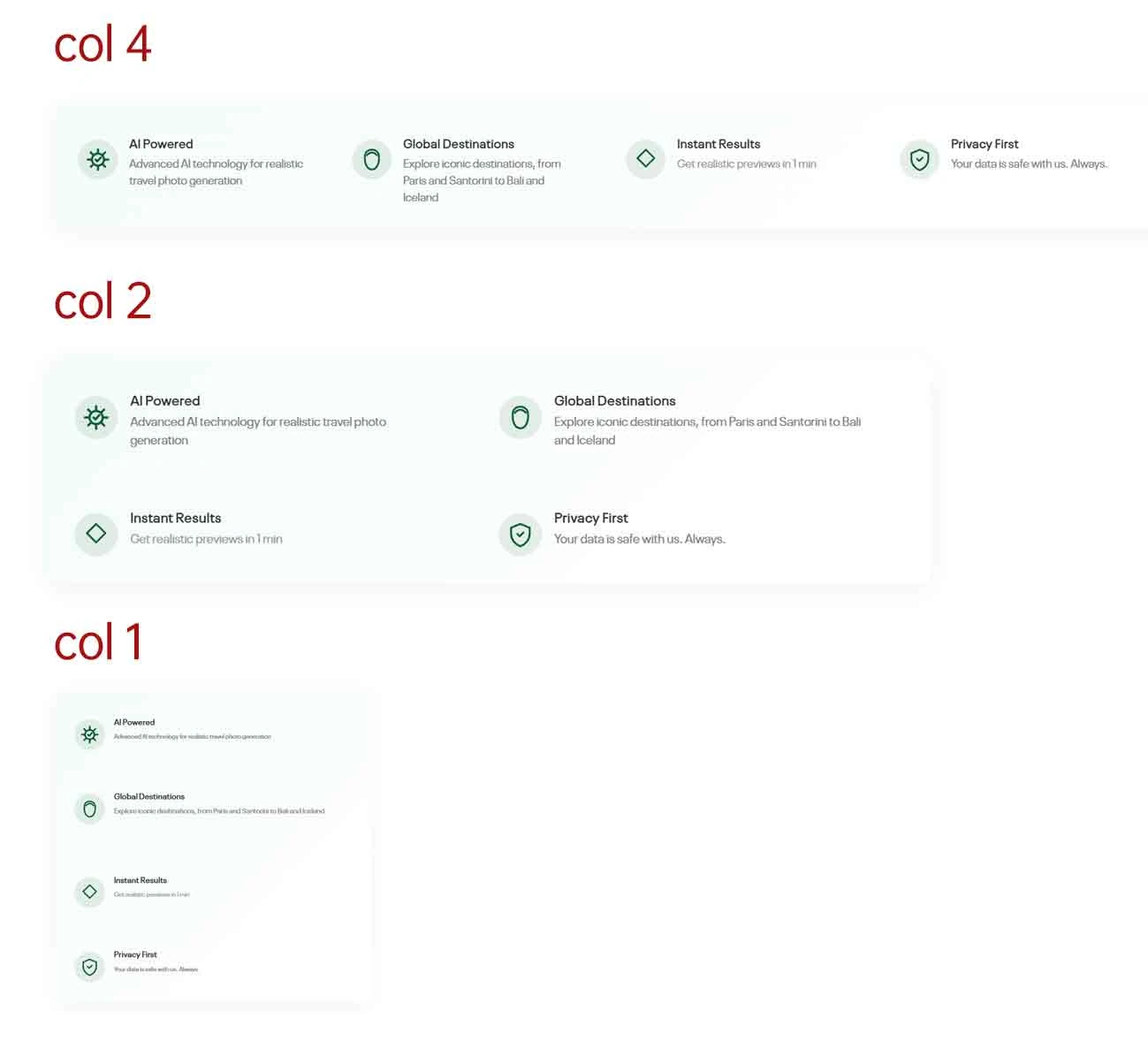
For most feature-list layouts, start with Balanced (4 / 2 / 1). If the content still feels too tight at a certain width, switch to Custom and adjust the column steps or the minimum module width until the modules have enough room.
Recommended Use
Choose Fixed for simple layouts that only need a desktop grid and a mobile single-column layout. Choose Auto for Groups with multiple internal items that need to remain readable across desktop, tablet, and narrow browser widths.