
This guide explains how to customize the SeaTryon Virtual Try-On button and popup panel in WooCommerce. These appearance settings help the customer-facing try-on experience match your store’s typography, colors, spacing, and responsive design—without editing CSS.
Open the SeaTryon appearance settings
- Sign in to the WordPress dashboard.
- Go to WooCommerce → Settings → Products → Virtual Try-On.
- Scroll to the button and Try-On panel appearance sections.
- After making changes, click Save changes and check an enabled product page on both desktop and mobile.
Customize the Virtual Try-On button size
The button appearance settings control the Virtual Try-On button displayed on enabled WooCommerce product pages. You can adjust its width, icon, text size, and height independently from the Add to cart button.
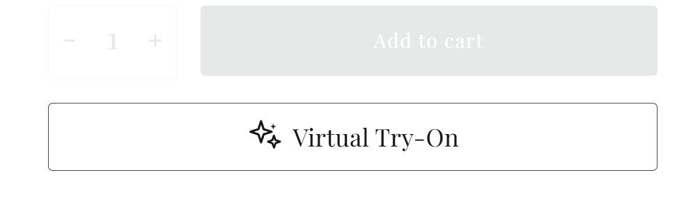
Button width
Enable Automatic (fit content) when you want the button width to follow the icon and label instead of stretching across the available product-summary area. Leave this option disabled when your theme or SeaTryon layout should use the wider default button presentation.
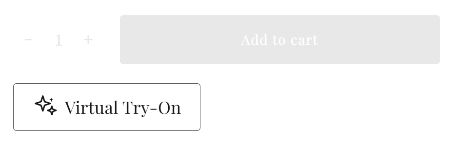
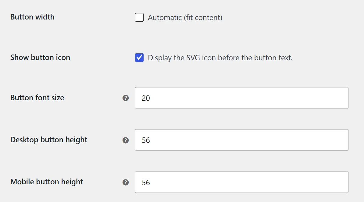
Icon, font size, and responsive height
- Show button icon: displays or hides the SVG icon before the button label.
- Button font size: changes the size of the Virtual Try-On label.
- Desktop button height: controls the button height on larger screens.
- Mobile button height: lets you use a separate, touch-friendly height on mobile devices.
Desktop and mobile button heights accept values from 30 to 120 px. A height around 44–56 px is a practical starting point for most stores, but the best value depends on your theme and nearby Add to cart controls.
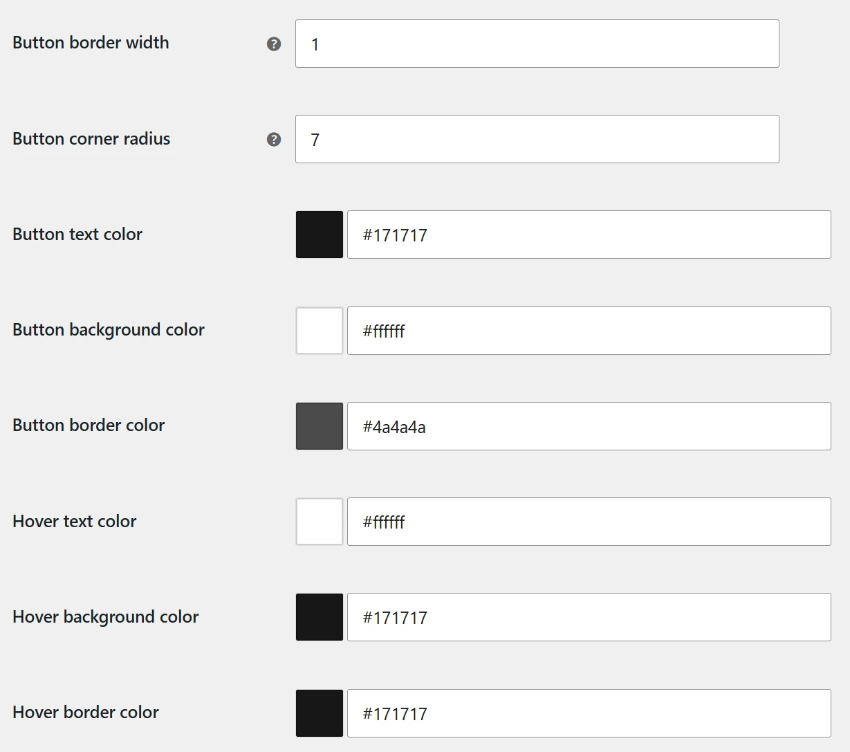
Customize the button border and corner radius
- Button border width: sets the border thickness in pixels. Enter
0for a borderless button. - Button corner radius: controls how rounded the button corners appear. Use a low value for square corners or increase it for a softer, pill-style design.
When the border width is set to zero, the normal and hover border colors will not be visibly applied, but you may keep those values ready in case you restore a border later.
Set button colors and hover colors
SeaTryon provides separate color controls for the button’s normal and hover states:
- Button text color
- Button background color
- Button border color
- Hover text color
- Hover background color
- Hover border color
Choose combinations with clear contrast so the label remains readable in both states. The hover colors should create a noticeable but consistent response when a customer points to the button.
What is the Try-On panel?
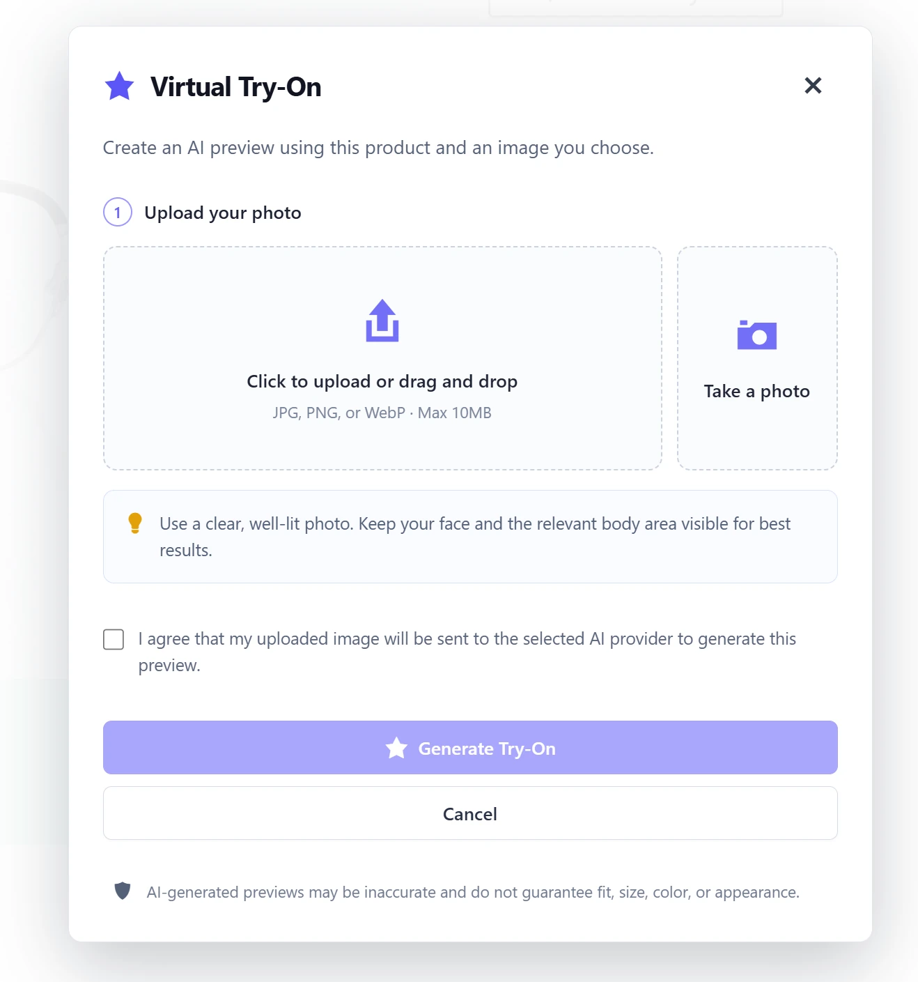
The Try-On panel is the customer-facing popup that opens after the shopper clicks the Virtual Try-On button. It contains the image upload or camera controls, guidance, consent option, generation button, and status or error messages used during the AI try-on workflow.
Customize the Try-On panel appearance
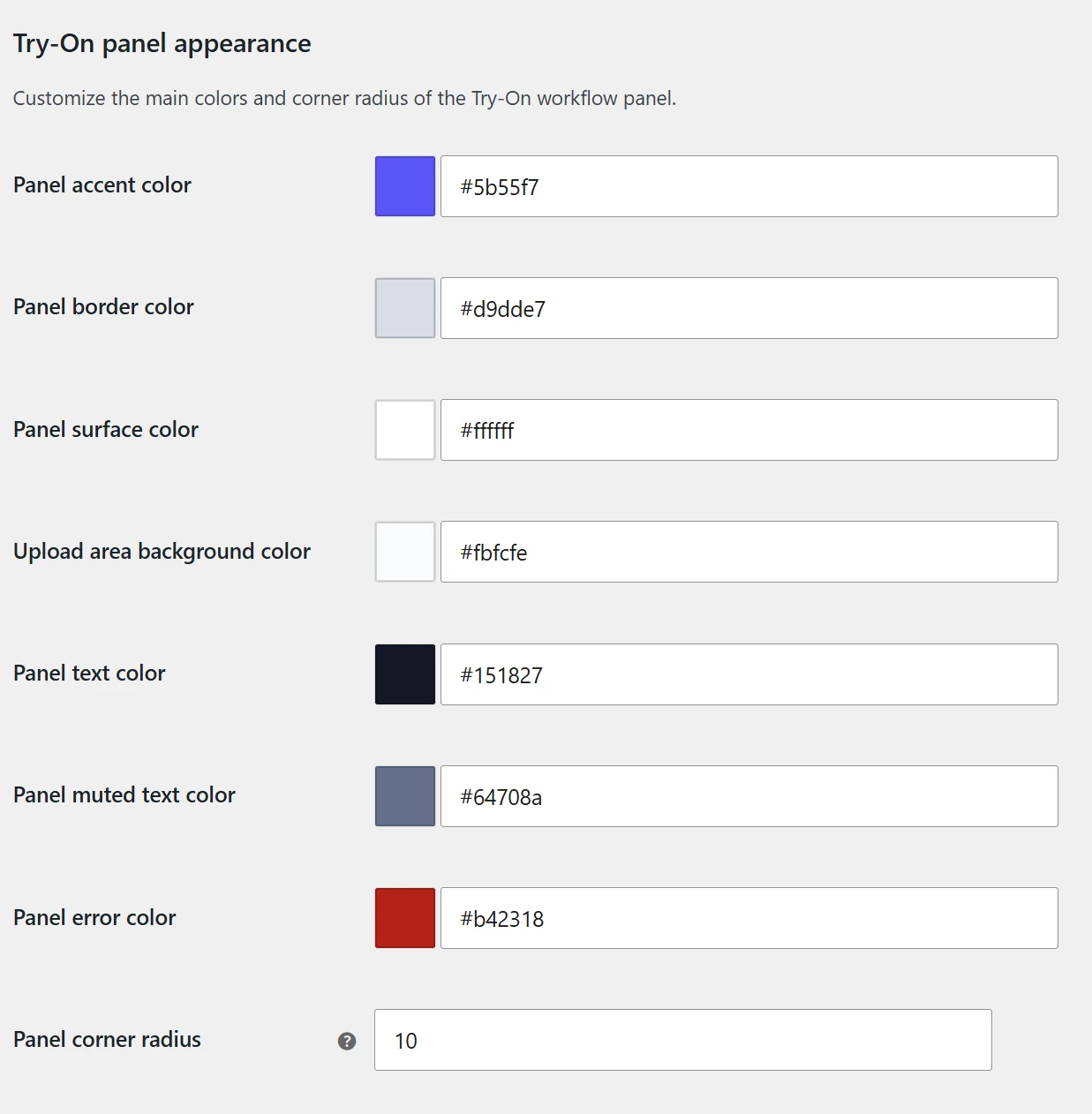
Use the Try-On panel appearance options to coordinate the popup with your WooCommerce store:
- Panel accent color: the primary highlight used for interactive elements, step indicators, and visual accents.
- Panel border color: the color used for panel and component outlines.
- Panel surface color: the main popup background.
- Upload area background color: the background inside the image upload area.
- Panel text color: the primary headings and instructional text.
- Panel muted text color: secondary explanations, hints, and less prominent text.
- Panel error color: validation and error feedback that requires attention.
- Panel corner radius: controls the roundness of the popup and helps it match your theme’s visual language.
Recommended checks before going live
- Check the Virtual Try-On button next to your quantity and Add to cart controls.
- Verify that normal and hover text meet your store’s readability and contrast requirements.
- Test the separate desktop and mobile button heights.
- Open the panel and confirm that primary, muted, and error text remain readable against their backgrounds.
- Complete one test workflow to review the panel’s upload area, consent control, action buttons, and error state.