The Grid module is a useful module of BM Content Builder, it is normally for creating Portfolio, Gallery, Blog , or Product list section.
To find the Grid module, you need to enter BM Content builder interface that built-in WordPress Page(or Post, Portfolio) editing interface. Please go to “Pages > Add New”, you will find the “BM Content Builder” button with blue color. It is entrance of the builder.

On the BM content builder interface, click Grid:

The Grid module is normally for creating a standard grid list, like:

Source
There are 4 options: Media Library, Portfolio, Post, and Woo-Commerce Product.

- If you want to create a Gallery list, please choose Media Library. You could select the images directly. Check tutorial for creating a Gallery here.
- If you want to create a Portfolio list, choose Portfolio. Check the tutorial for creating a Portfolio(ART theme, SEA theme).
- If you want to create a Blog, please choose Post. Check the tutorial for creating a blog here.
- If you want to create a Product list, please choose Woo-Commerce Product.
Category & Order
If you choose Portfolio, Post, or Woo-Commerce Product, you need to pick up a Category. All portfolios(or post/product)from this category will be shown on the Grid.
Before creating a Grid, you should create several portfolios(or post/product) by single portfolios, they should be set with a category. Each portfolio should be set a “Featured Image” as the thumbnail shown in the Grid.

If you want to control the order of the thumbnails in the Grid, please pick up “Date” in the selector “Order”. Ascending order means the earliest item(Portfolio, Post, Product) in the order will appear at the top of the list. Descending order means the last item in the order will appear at the top of the list.
You could edit each item(Portfolio, Post, Product) date. Edit a Portfolio(in “Portfolio>All Portfolio”), click the date at the right column:

Column & Spacing

Column: It supports 1-12 columns for desktop/mobile.
Item Spacing: You can set the vertical and horizontal spacing separately. You can set the grid spacing for desktop and mobile separately also.

Item Ratio
Grid Ratio: The Grid item ratio supports 4:3, 3:2, 16:9, 2:1, 1:1, 2:3, 3:4, Auto. The Auto will be shown as the image origin ratio.
Fit Image into Grid: The images are filled into the grid by default(the images will be cropped). If the “Fit Image into Grid” option is activated, the images will be fit within the grid, the size of the image will be limited in the grid.

Grid List Type: there are Regular and Waterfall options, the Regular is the default option. The extra top/bottom spacing between items will be removed. It will look like:

Pagination
If you don’t want to show all Portfolios/Posts/Products(items) by default, please activate Pagination. Grid module supplies Ajax pagination function, the pagination types includes Load more button and Infinite Scroll. Please enter a number for “Post Number per Page“. Eg entering 20. So if you have 25 items, you would have 3 total pages.
If you want your users to load the next page of posts by clicking on the more button, please pick up option Load More Button for the Pagination. If you want your users to automatically load the next page of articles when they scroll to the bottom of the page, please pick up option Infinite Scroll for the Pagination.
Filter
Checkout how does the filter work.
Image Lazy Load
It is for the page loading speed. Normally(disable this option), the webpage will be shown when all images are loaded. It will take a long time to wait. Image Lazy Load means loading images on websites asynchronously — that is, after the above-the-fold content is fully loaded, or even conditionally, only when they appear in the browser’s viewport.
Notice: Please stop the lazyload option (like Smush, Jetpack) in the 3rd plugin. It will be in conflict with ours.
Item Style
Item Style: There are 2 options: Image and Image + Text


Mouseover Effect
Please check the tutorials about mouseover effect options.
Text Type
“Image” item style
- For the source of “Portfolio” and “Post”, it can show the portfolio(post) Title, Category, Tag, Excerpt, Date
- For the source of “WooCommerce”, it can show the product Title and Price
- For the source “Media Library”, it can show the image Title (They could be defined in Media Library when you pickup an image).

“Image+Text” item style
- For the source of “Portfolio”, it can show the portfolio(post) Title, Category, Tag, Excerpt, Date.
- For the source of “WooCommerce”, it can show the product Title and Price
- For the source of “Media Library”, it can show the image Caption(If there is not the caption, it will show the Title).
- For the source of “Post”, there is a selector of “Item Layout”, there are 2 kinds of layout:
Image on Top: it can show the Title, Category, Tag, Excerpt, Date. It will show special item layouts based the post format, it is possible to create a Blog style grid layout. As shown on this demo page.

Image on Left: the featured image is on the left of item, as shown on this demo page. It is possible to define the width of image, the options: 25% / 30% / 40% / 50% /60%

List BG option
You could set the text style, padding, BG color, and text position:

What Thumbnail Does

The option is for what’s the target when the user clicks the thumbnail.
1. Open a single portfolio/post/product item or custom URL, it will open the single portfolio, post, or a single WooCommerce product page.
If the source is set as “Media Library”, it will open the image itself. You can also set a custom URL in the WordPress “Media Library”:

Open in New Window/Tab: open a single portfolio/post page in a new window/tab.
nofollow: It is for network security. If you open the external link(other websites URL), please enable it.
Tap Once to Open Item on Touch Screen: On the mobile, you will tap twice to open the single portfolio. The 1st tab is for showing the text, like the mouseover on the desktop. The 2nd tab is for the opening single portfolio. If you enable the option, it will open a portfolio by once tab on the mobile.
Notice: if enable the Lightbox, it will always be opened by the once tab.
2. Open Lightbox – open the thumbnail in the Lightbox. The user can slide the thumbnails in the Lightbox

You could set the Lightbox color skin in Theme options(Theme Options > Colors > Lightbox Color Skin) . You could disable the download, fullscreen, zoom buttons in the Theme options( Theme Options > Content > Lightbox)
Open Second Featured Image in Lightbox – If select the Second Featured Image in the “Mouseover Effect”, it will open the second featured image instead of the default featured image
Exclude Current Post
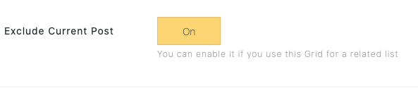
If you don’t want the current post to appear in this Grid(for example, if this Grid is being used as a related posts list), please enable this option.
Video Tutorial
Content:
00:10 – Add a new page, enter a title
00:22 – Activate BM Content builder, insert the Grid module
00:29 – Select a category
00:40 – Set the column, spacing, ratio
01:10 – Set the column and spacing for the mobile layout
01:47 – Set the Waterfall grid layout
02:03 – Fit image into Grid
02:18 – Set the categories as the Filter
02:50 – Set the pagination(Load more button or Infinite scroll)
03:35 – Creating the portfolio from the Media Library
04:20 – Edit the image Title (Source: Media library)
04:40 – Set the custom URL for the image(Source: Media library)
05:05 – Set the categories for the image(Source: Media library)
05:58 – Set text style
06:58 – Config Item Style and Mouseover effect
08:52 – List Background
09:30 – set opening image in the Lightbox, open portfolio page in new tab/window