
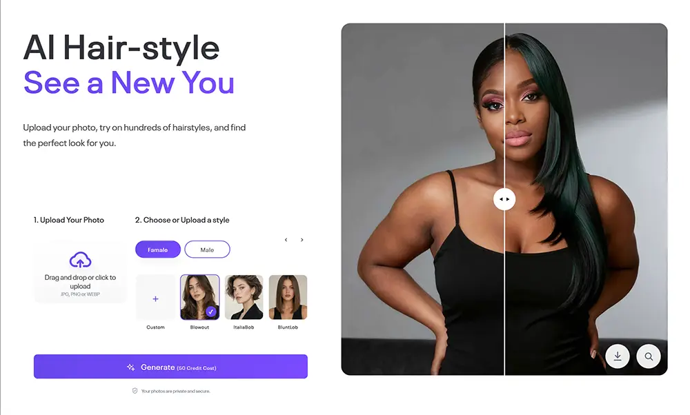
This guide explains the main options in the AI Image module. The module is used to build an AI image generation interface in BM Builder, including the upload area, generation button, style picker, default comparison images, and RunningHub workflow configuration.
This option was added starting from v4.0
Add the AI Image Module
To find the Group module, Please go to “Pages > Add New”, click “BM Content Builder”

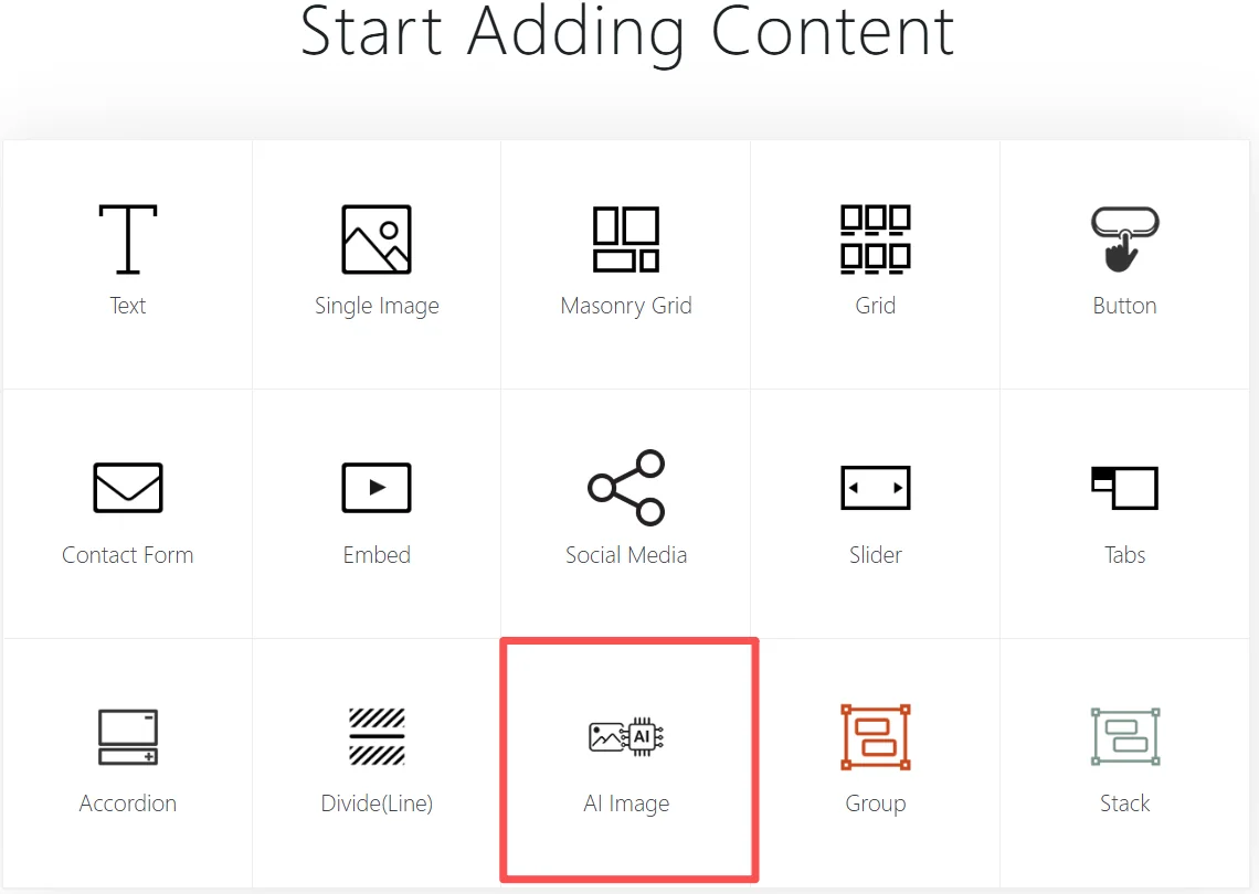
In BM Builder, open the content module picker and choose AI Image. This adds an AI image generation module to the page.
General Settings Overview
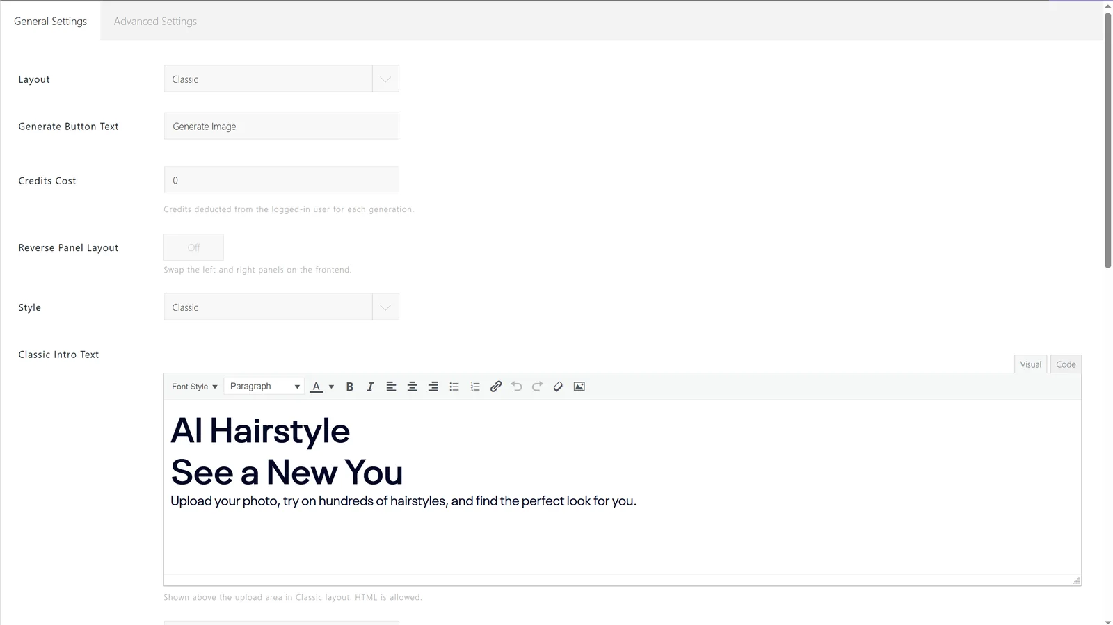
The General Settings tab controls the user-facing layout and labels. Use this area to decide how the AI image tool appears on the frontend.
Layout

Layout selects the frontend display style. The Classic layout shows the upload area, option area, and result comparison in a guided flow.(There is only Classic option for now)
Generate Button Text

Generate Button Text changes the label of the button users click to start image generation. Use clear action text such as Generate Image.
Credits Cost

Credits Cost sets how many credits are deducted from the logged-in user for each generation. Set this value according to your subscription or credit pricing model.
You can set the the credits cost per generation based on the API cost, other costs, and package prices.
Reverse Panel Layout

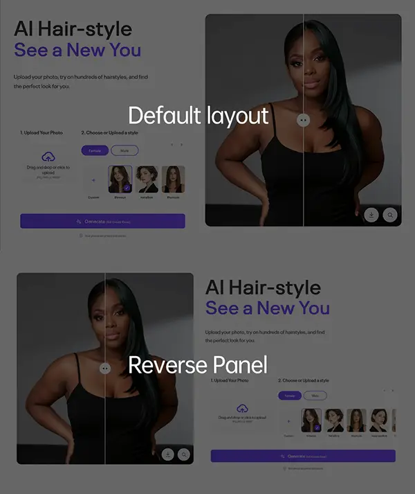
Reverse Panel Layout swaps the left and right panels on the frontend. Enable it when the upload or control panel should appear on the opposite side.
Style

Style controls the visual preset for the module. There are 2 options for the UI style: Classic and Light shadow
Classic Intro Text
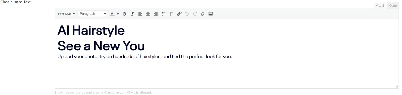
Classic Intro Text appears above the upload area in the Classic layout. HTML is allowed, so you can add a heading, short description, or introductory instructions for users.
Upload Title Text

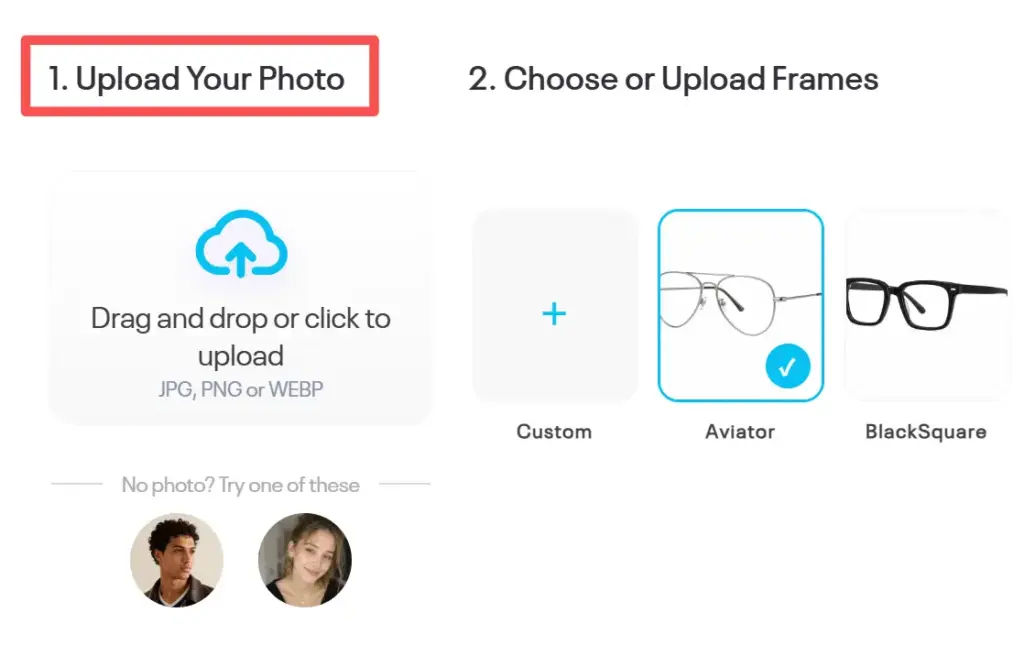
Upload Title Text is shown above the upload area. Use it to label the main image uploader(the image to be edited) in the Classic layout, such as a portrait photo.
The Title will show here:
Upload Description Text

Upload Description Text appears below the upload title in the Classic layout. Leave it empty if you do not want to show extra upload instructions.
Enable Preset Upload Images

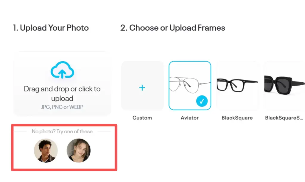
Enable Preset Upload Images shows selectable preset images for the main image uploader. Turn it on if users should be able to start from prepared sample images.
You can pickup some image as the preset, they will show on:
Enable Style Picker

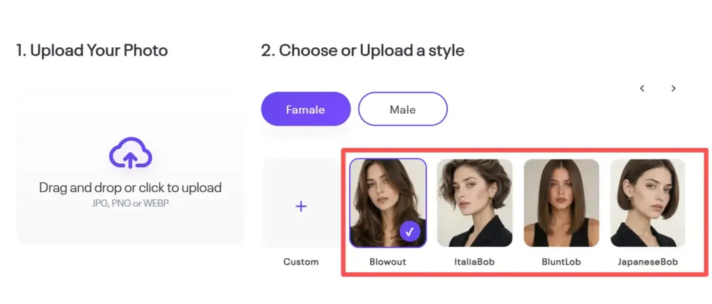
Enable Style Picker displays a second image selector ss shown in the red box in the image below, such as a hairstyle, makeup style, or other reference style used by the AI workflow.
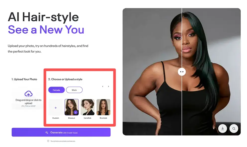
It is optional. For some App like the photo enhancer, it should be off.
You can pickup or upload some images as the Style placehoder images:
Enable Style Picker Tabs

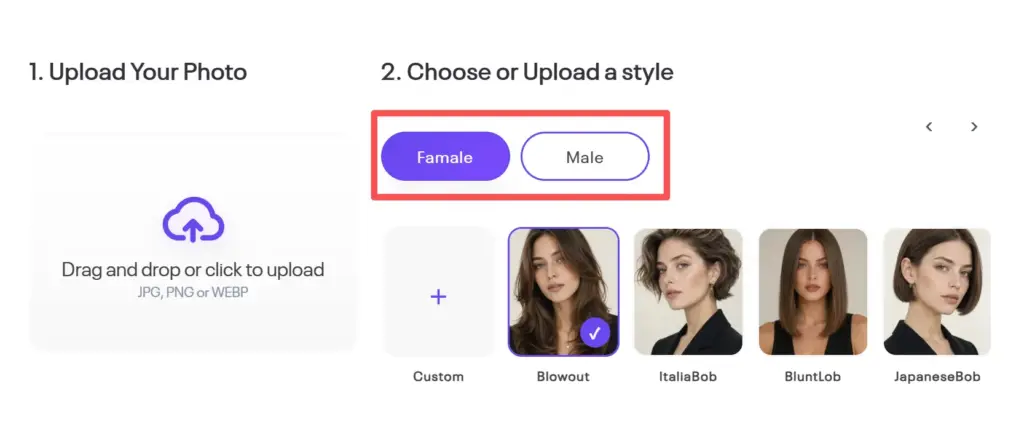
Enable Style Picker Tabs shows tabs in the style picker. This is useful when style images need to be grouped into categories. Sometimes, style reference images need to be filtered using filter tabs. For example, for hairstyle styles, male and female hairstyles can be used as filter tabs.
Choose Style Text

Choose Style Text changes the label above the style picker. Use it to guide users through the next step, for example 2. Choose a style.
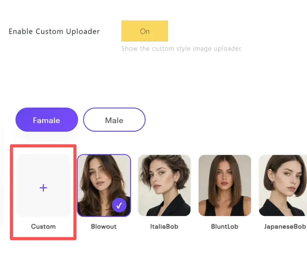
Eable custom uploader
To show the uploader for the second image(style or reference) image.
Style Picker Items

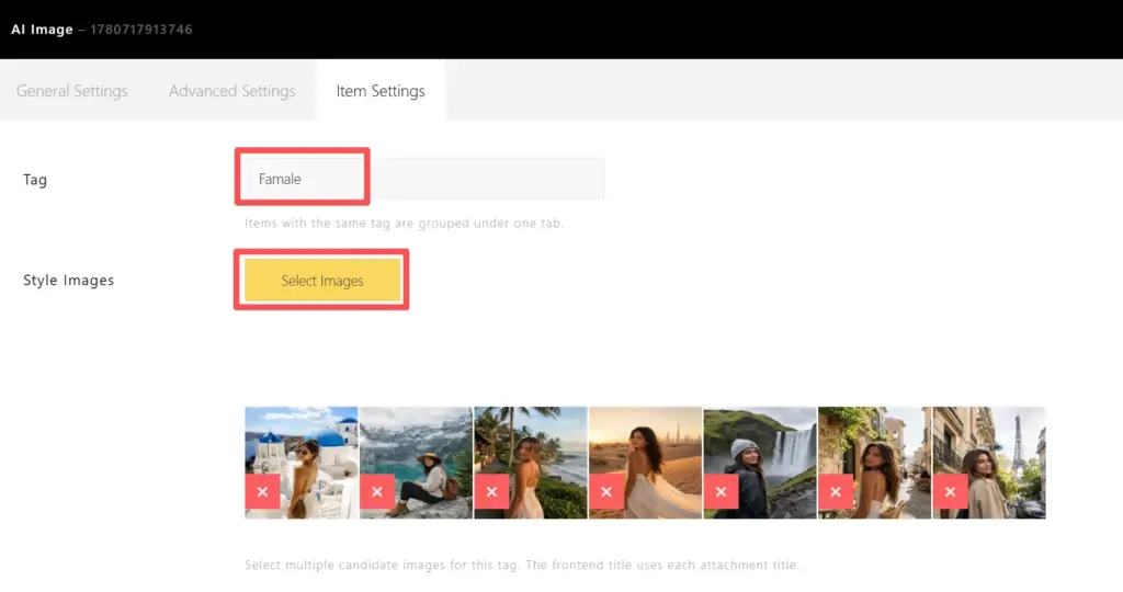
Style Picker Items defines the available style groups. Each item is one tab group with multiple selectable images. Use Add Tab to create more groups, then edit each tab to add its style images.
Click the pencil icon, the items tab display, you can edit the tab name and upload the placehoders.
Display custom loader without item picker
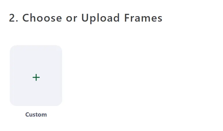
To show the custom uploader without style items picker, delete the all tab and eable the custom uploader:

Result Showcase Layout
It is for the result showcase layout, there are 2 options: Before/After and Input/Result

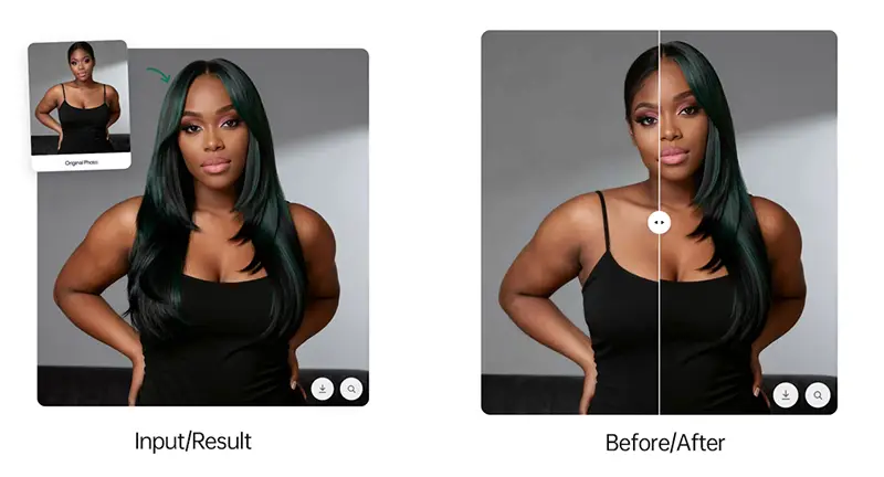
Default Before(Input) Image

Default Before Image is shown in the Classic comparison area before the user uploads a photo. It can be used as a placeholder or example starting image.
Default After(Result) Image

Default After Image is shown in the Classic comparison area before generation finishes. It can preview the expected result style or keep the comparison layout balanced before the AI result is ready.
Advanced Settings Overview
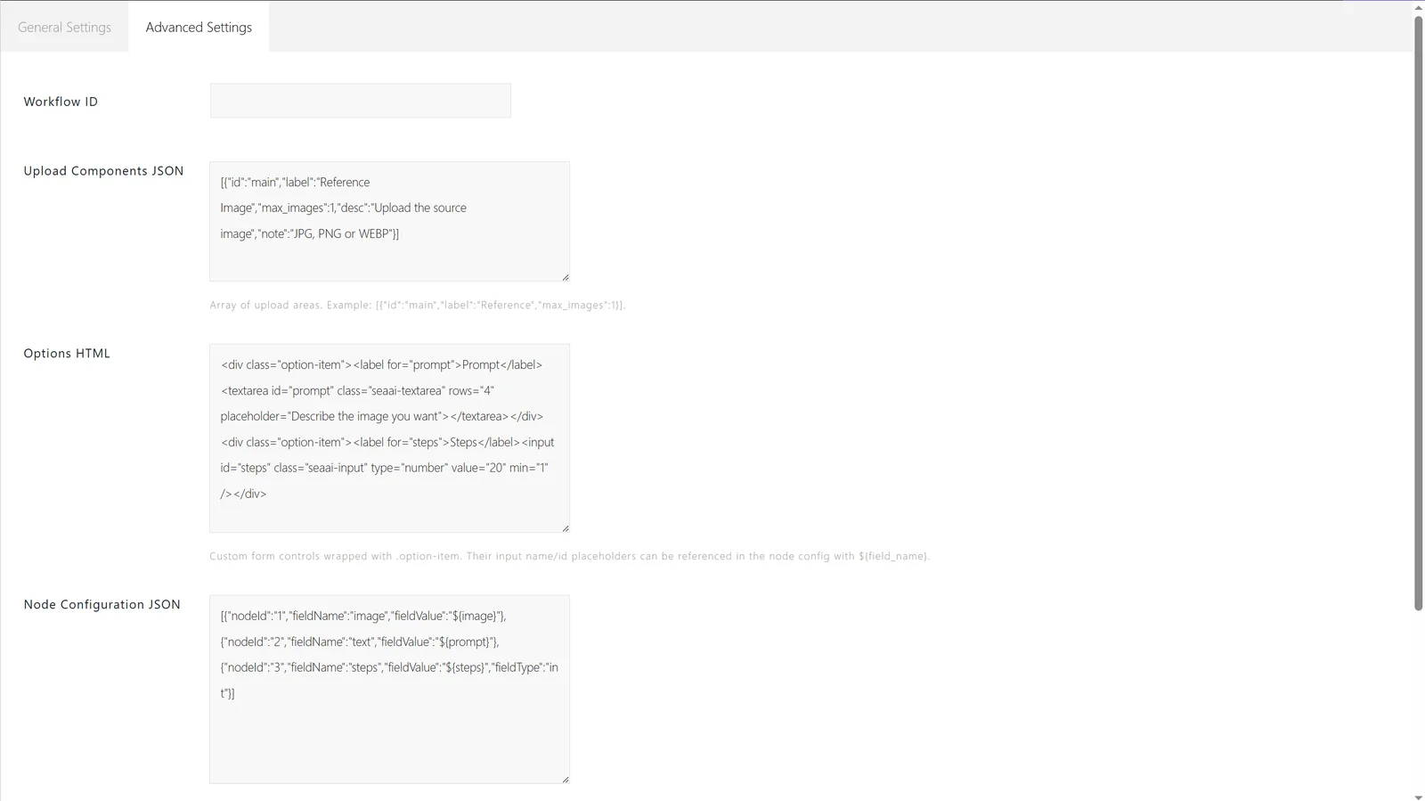
The Advanced Settings tab connects the frontend module to the AI workflow. These settings are usually configured by the site builder or developer.
Workflow ID

Workflow ID identifies the RunningHub workflow used by this module. Enter the workflow ID that should process the uploaded images and option values.
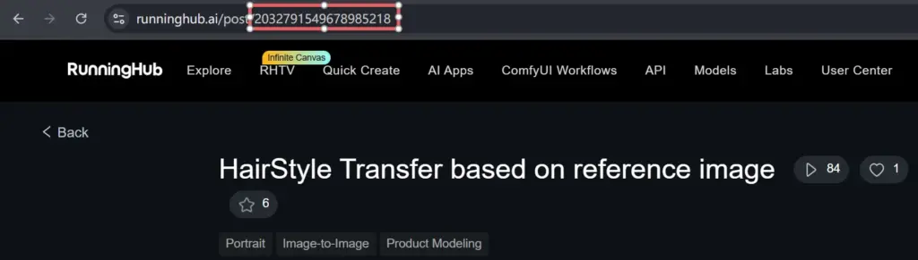
- The Hairstyle transfer workflow ID: 2032791549678985218
- The Makeup transfer workdflow ID: 2059627470986498050
- The portait retouching workdflow ID: 2059834534019035137
To get a workflow ID on the RunningHub, you can find the number on a workflow Url:
Upload Components JSON
Upload Components JSON defines the upload areas shown to users. Each upload area can include an ID, label, maximum image count, description, and file note. Please keep the default settings.
Options HTML
Please ignore this option; it is reserved for future upgrades.
Options HTML adds custom form controls for the AI workflow, such as prompt fields, number inputs, or other user-adjustable parameters. Wrap each control with .option-item and use stable input names or IDs.
Node Configuration JSON
Node Configuration JSON maps frontend values to workflow nodes. Please modify the number of uploaded images and the node ID in the corresponding ComfyUI workflow; the default is 2 uploaders.
In the ComfyUI workflow, locate the Load Image node, and find the number in the upper-right corner of the node — that is the ID.
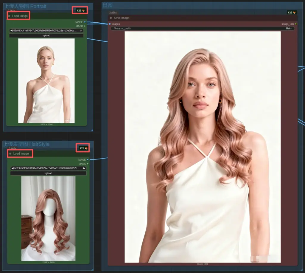
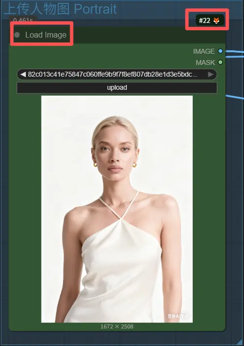
If there are 2 nodes, the first node is for the portrait image, and the second node is for the reference image, such as a hairstyle or makeup style image.
The Json for HairStyle transfer:
[{"nodeId":"22","fieldName":"image","fieldValue":"${main}"},{"nodeId":"21","fieldName":"image","fieldValue":"${classic_style_image}"}]The Json for Makeup transfer:
[{"nodeId":"3","fieldName":"image","fieldValue":"${main}"},{"nodeId":"1","fieldName":"image","fieldValue":"${classic_style_image}"}]The Json for portait retouching:
[{"nodeId":"642","fieldName":"image","fieldValue":"${image}"}]